COSTCO PHOTO CENTRE CANADA
For the past years this client has been portraying their variety of products in a lifestyle setting giving ideas of how the products can interact in an environment way or can be used by the customer.
We challenged ourselves to redesign our assets giving a new fresh look to the site and great unexpected results happened.
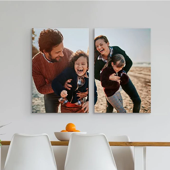

CHALLENGE - OLD DESIGN
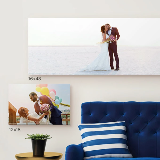
The lifestyle purpose in the banners represent environments where the product lives.
The imagery is old-school and doesn't follow a unique style.
The products are displayed in a flat way. No details about the product are showing (depth, texture, quality)
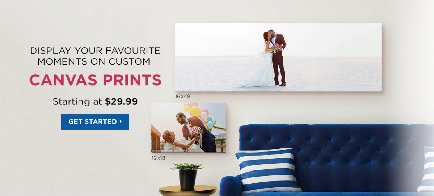
OPPORTUNITY TO APPROACH - GOAL
We realized that our main consumer was used to see the product behaving in a lifestyle setting but they were not used to see it closely. They have never seen them from a different angle, perspective or dimension.
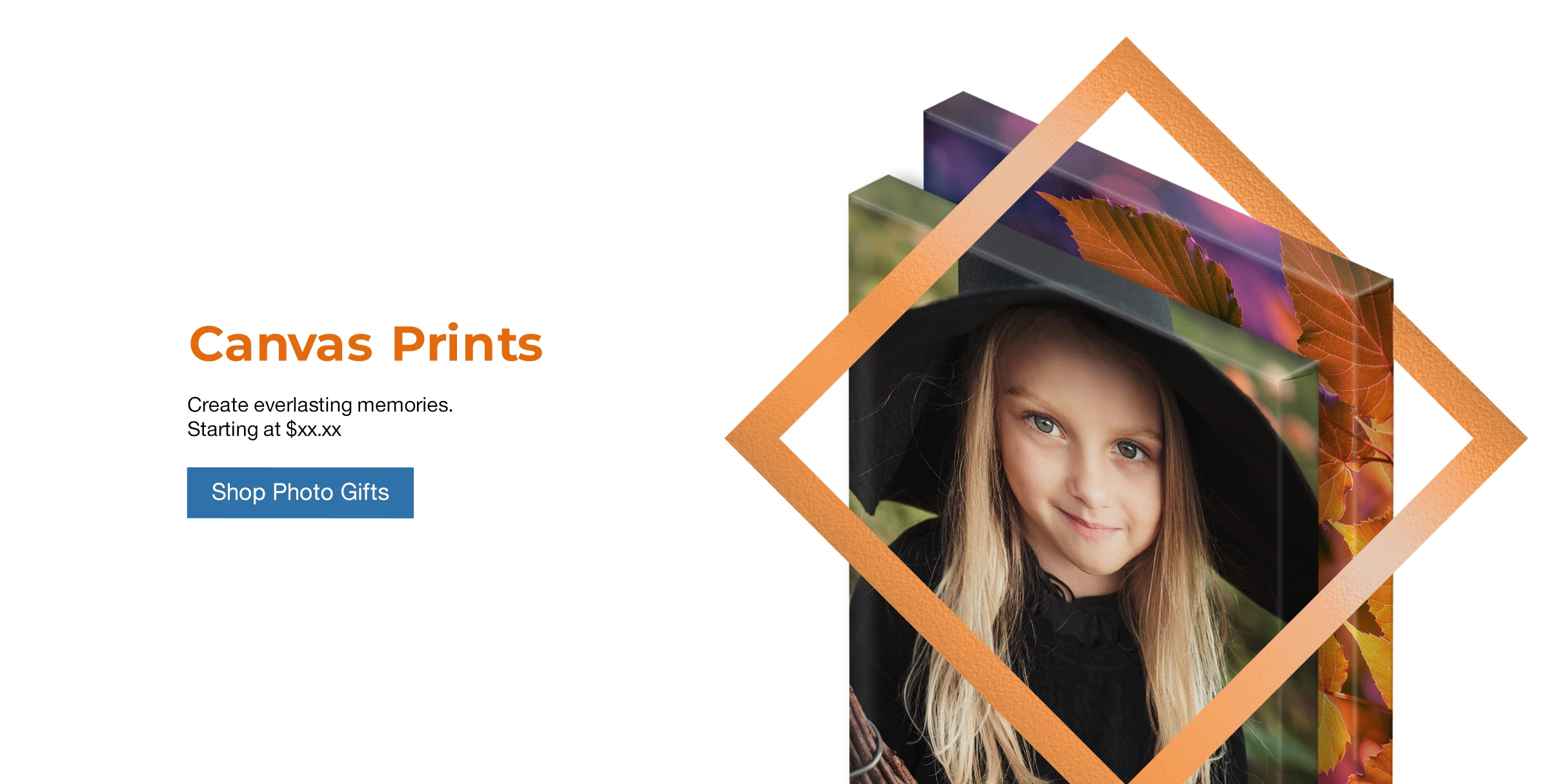
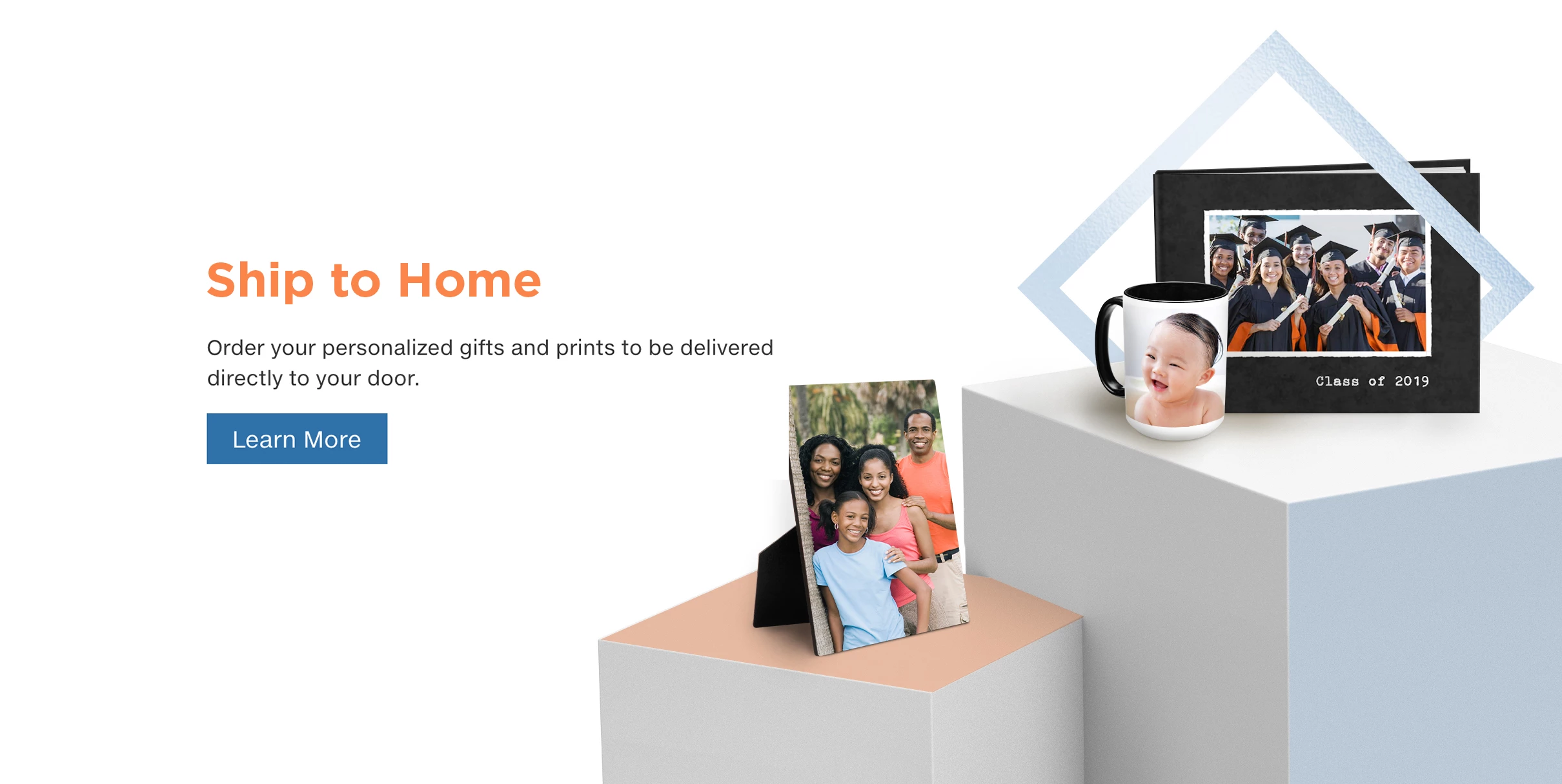
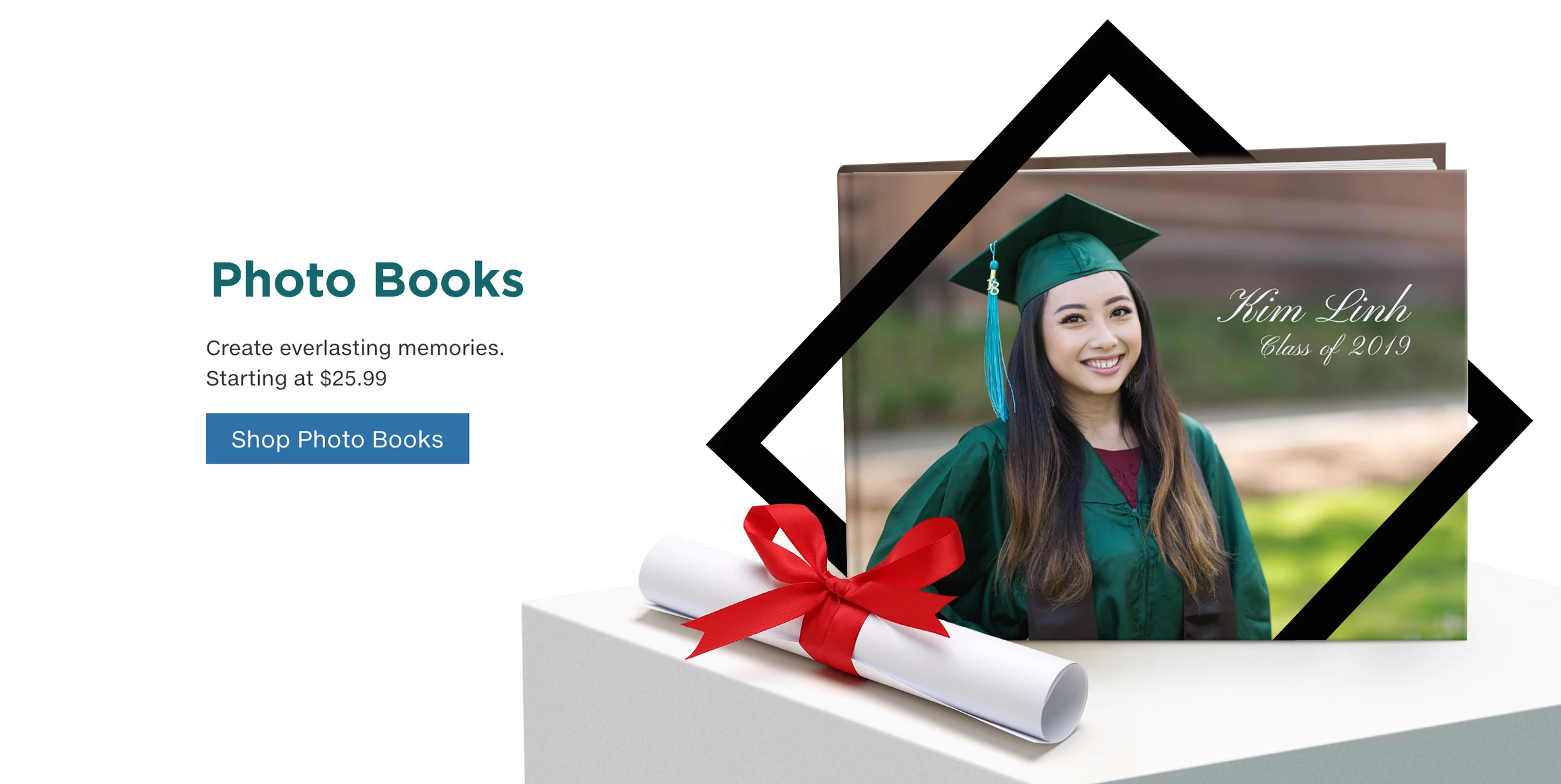
We decided to bring attention to the product by making them BIG and playing them "solo" in an atmosphere of infinite background preventing any distraction from the product.
We passed from knowing how can we use the product to knowing the characteristics of the product itself.
RESULTS - NEW DESIGN
By having big scale images we can show details (texture, quality and materials)
Each product has different angles to show which brings more dynamism.
Assets look modern, simple and clean.
Due this new face we got a new.
The new face also developed a new Style Guide.
Baby boomers have been the core support target customer of Costco Photo Centre CA;
due this new face we reached a new different target (Millennials).
This has been so far the best approach with any new redesign CPC-CA has ever came up with.

